lecture08
Building a plot layer by layer
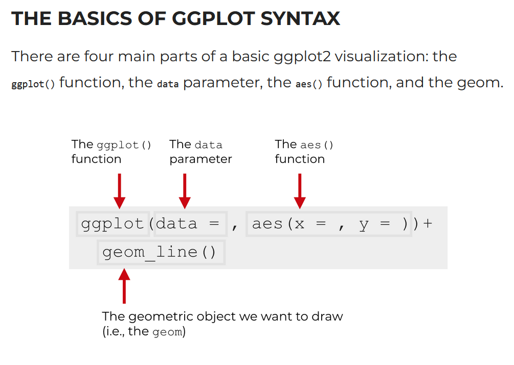
Overview of the ggplot() syntax
Source: blog/sharpsightlabs.com:
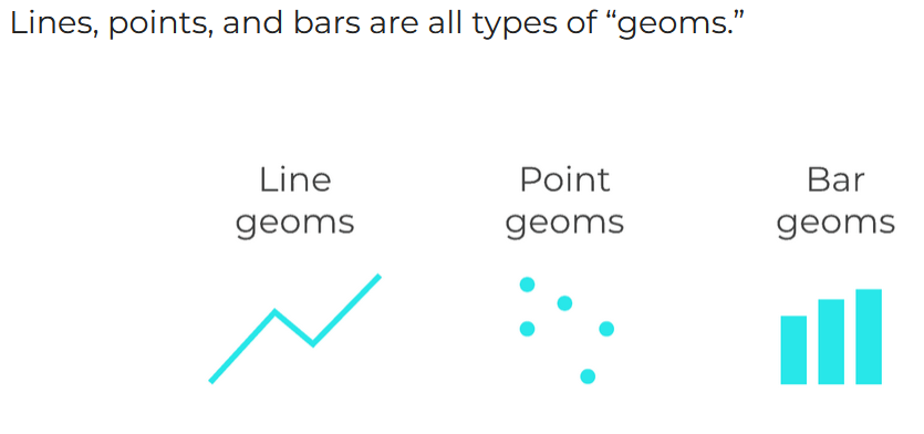
Geom layers
Source: blog/sharpsightlabs.com:
There’s many more geoms in the ggplot cheatsheet!
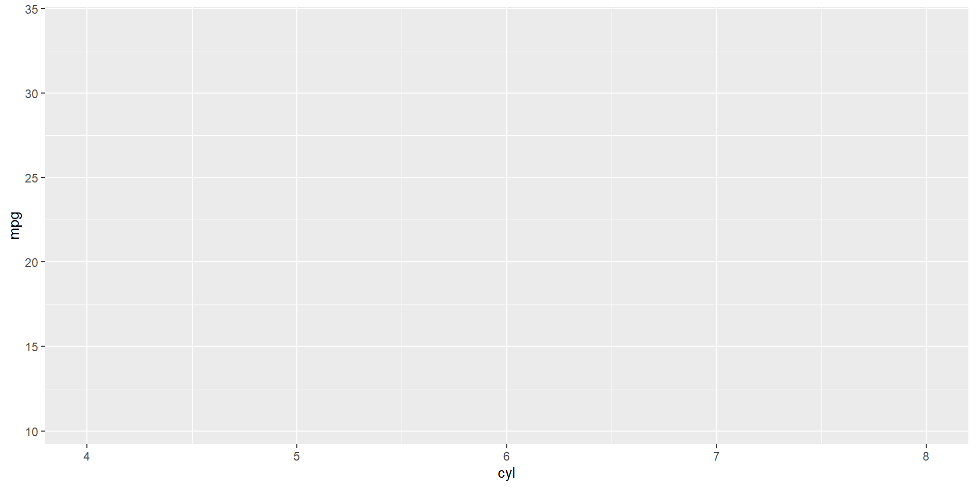
Let us quickly see an animation of empty plot, adding axes, adding data for the histogram
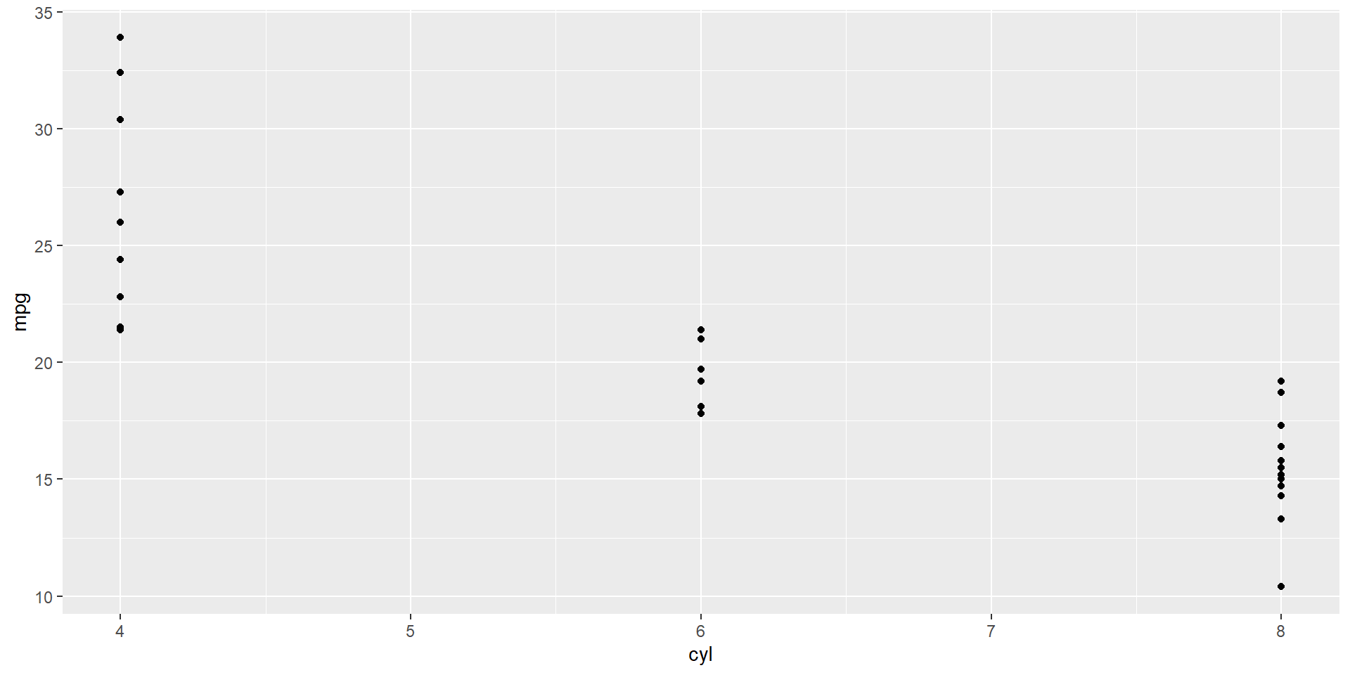
Empty plot: ggplot() call

Adding axes: mapping = aes()
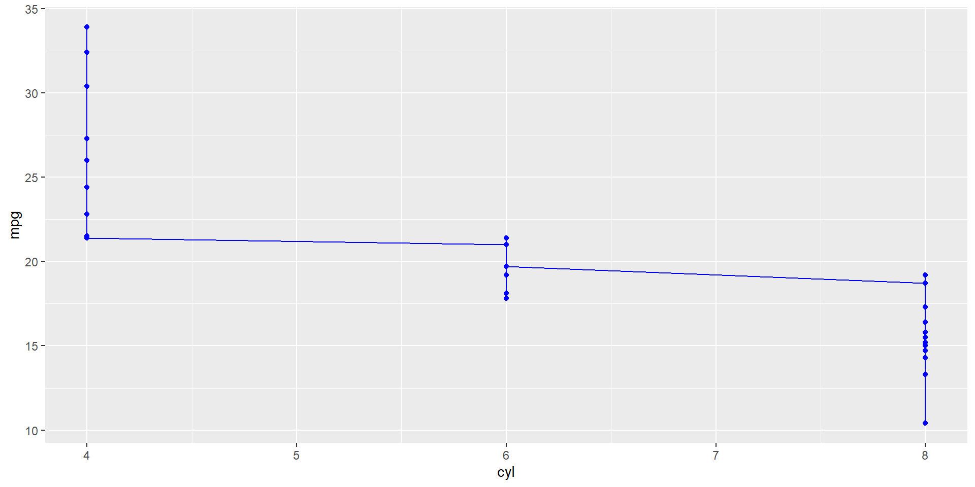
Adding points: geom_point()
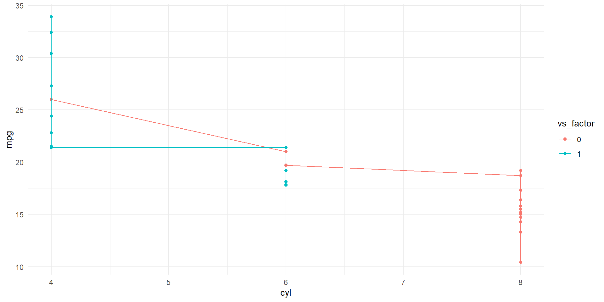
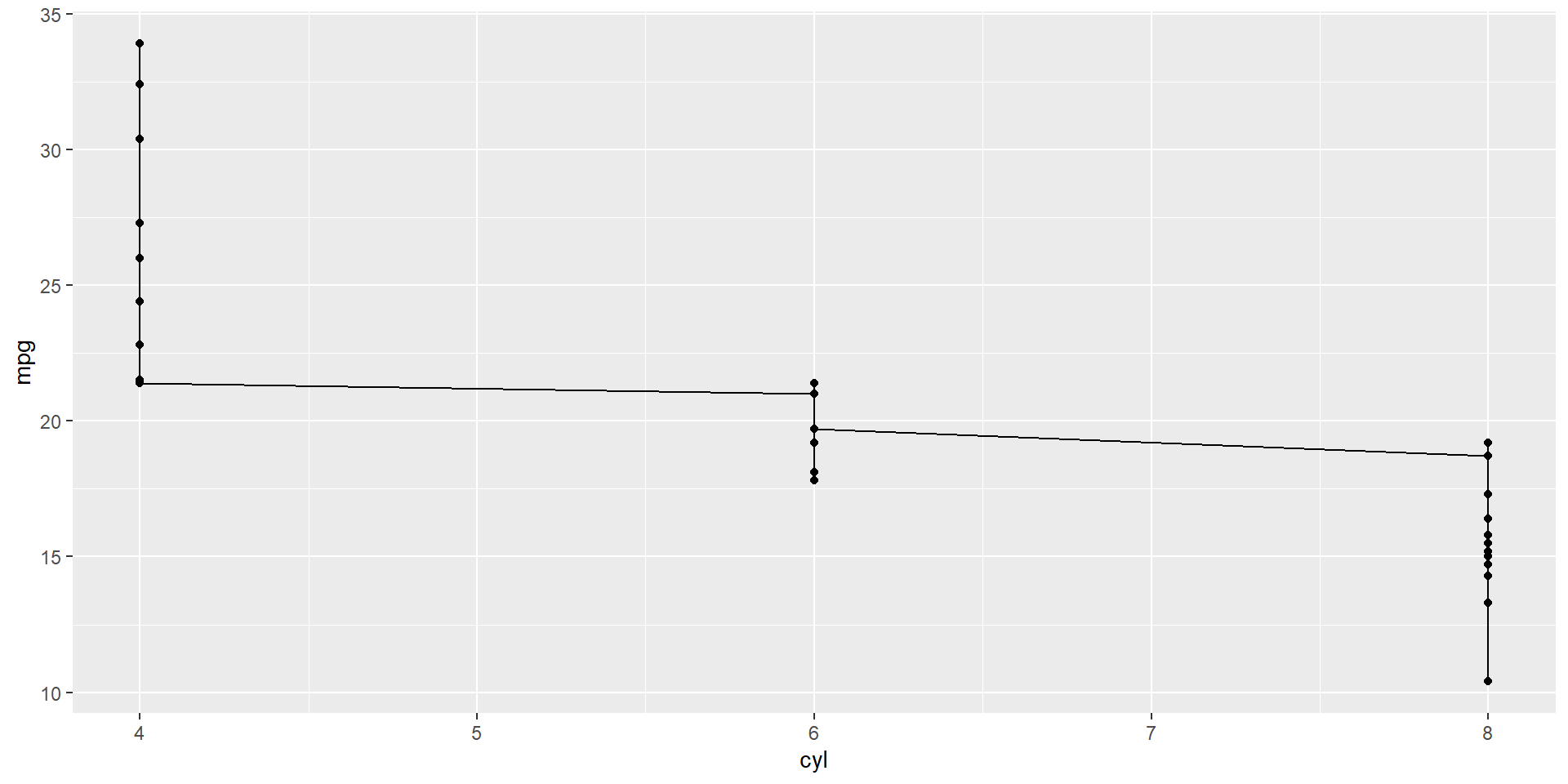
Adding line: geom_line()

Call the plot object to display/ print it
Make a constant colour = 'red' - Doesn’t work
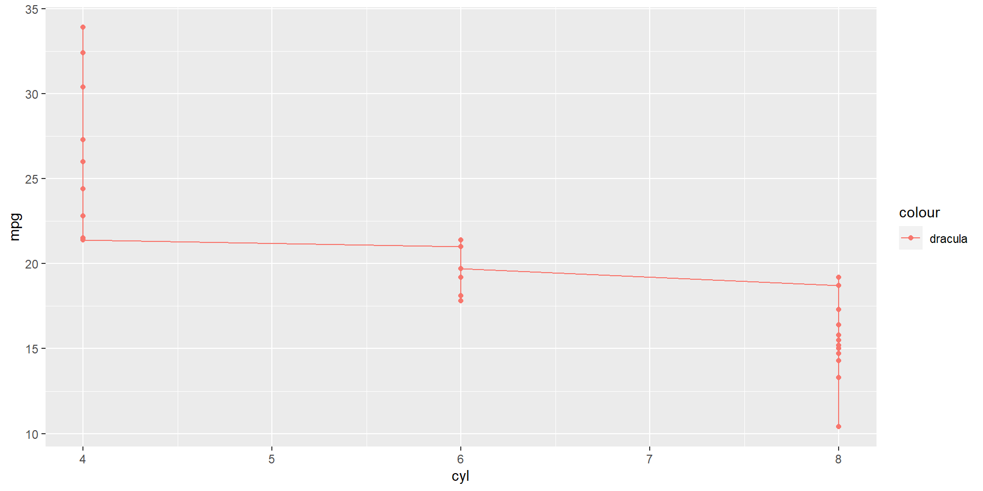
Did the colour = 'red' really work?
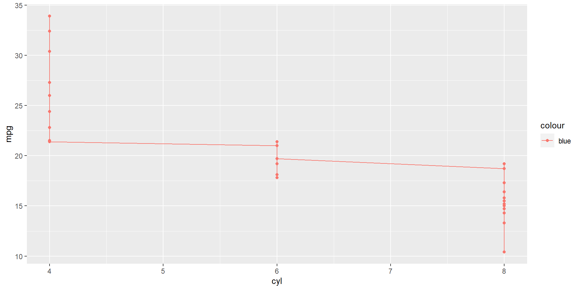
Make a constant colour = 'red' outside aes()
Hint: There should be no legend!
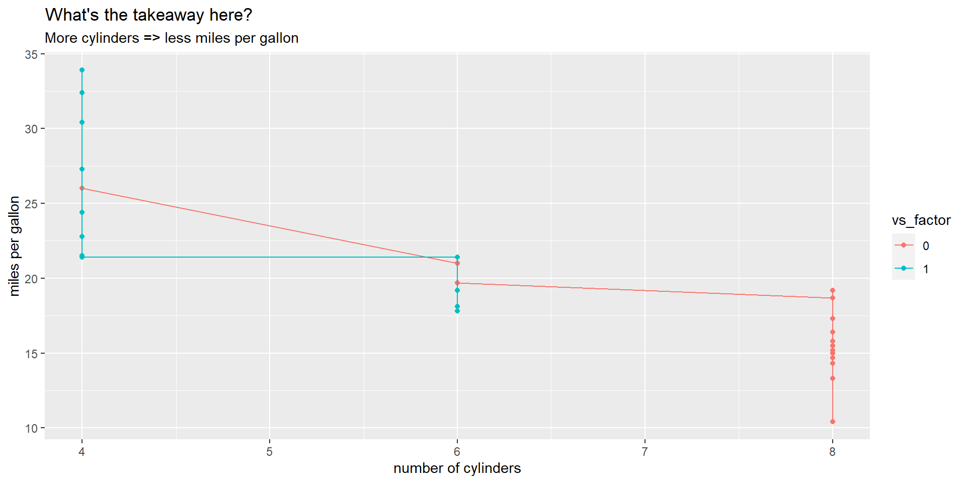
Making axis labels great again
colour_plt +
  labs(
    x = 'number of cylinders', y = 'miles per gallon',
    title = "What's the takeaway here?",
    subtitle = 'More cylinders => less miles per gallon'
  )

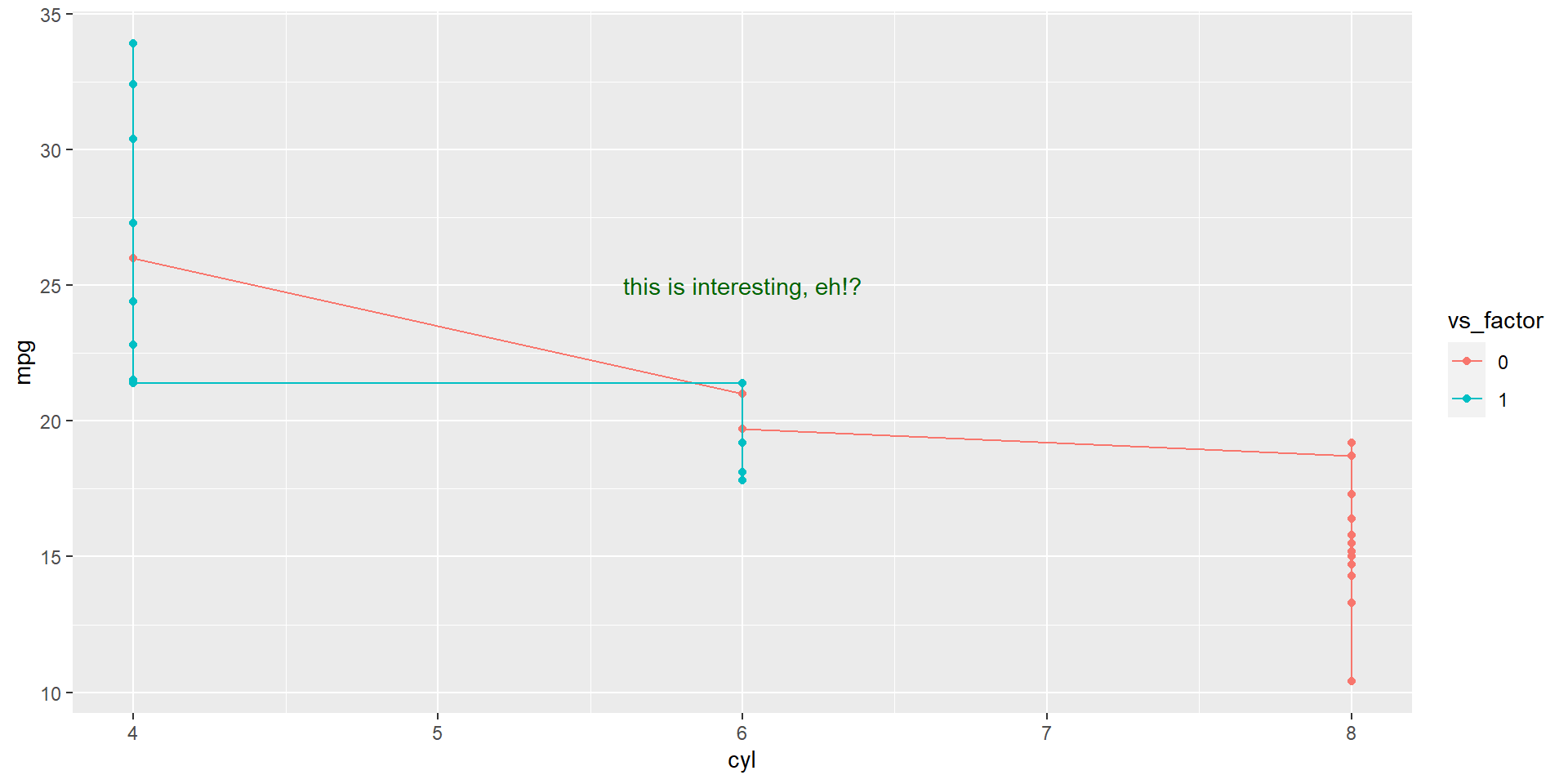
Add text annotations on the plot
Make broad style changes based on theme