lecture 9: Quarto markdown

Intertwine R code along with narrative, and outputs

Annie Finneran

Why does this matter?

  • Allow other scientists to easily interpret and reproduce your work

  • Organize your thoughts intertwined with code, graphs, tables, stats

  • Help your future self!

    • You very quickly forget what you were working on once you take a break from it.

Quarto vs. RMarkdown

  • Quarto (named after the word for a book/pamphlet created in a certain way) enables you to weave together content and executable code into a finished presentation. To learn more about Quarto presentations see https://quarto.org/docs/presentations/.

  • Some of you may have heard of RMarkdown, which is similar to Quarto, except Quarto has more outputs and built in capabilities, so we will focus on Quarto for this lesson.

Wait what is a markup language?

  • “A markup language is a text-encoding system which specifies the structure and formatting of a document and potentially the relationship between its part” (google AI is the source lol)

    • Basically annotating a text, like you would with pen and paper
  • Examples: LaTeX, HTML

  • What about Microsoft Word or Google Docs?

    • These are NOT markup languages. These are word processors with visual formatting. However they have markup languages working behind the scenes.

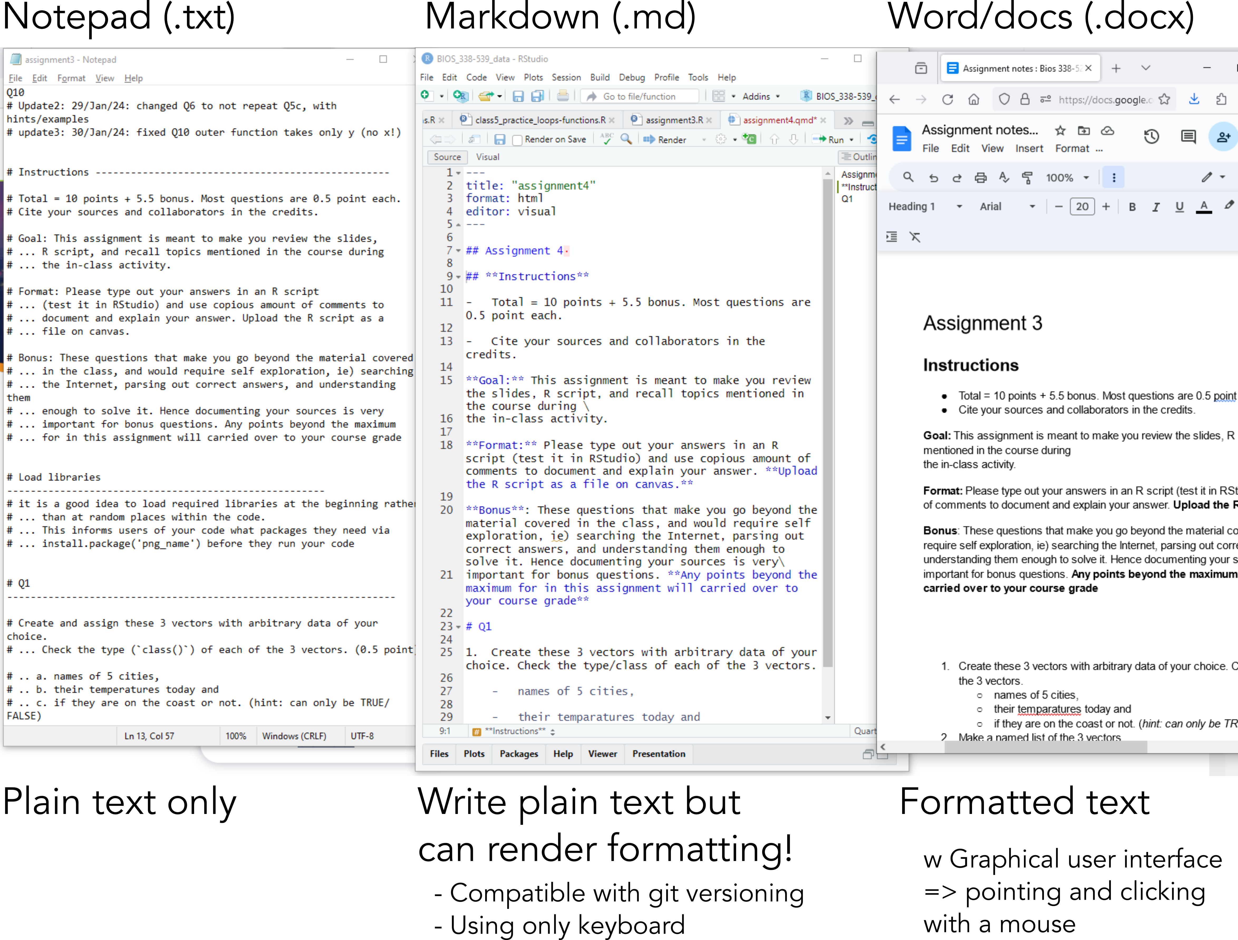
Plain text only = Notepad (.txt)

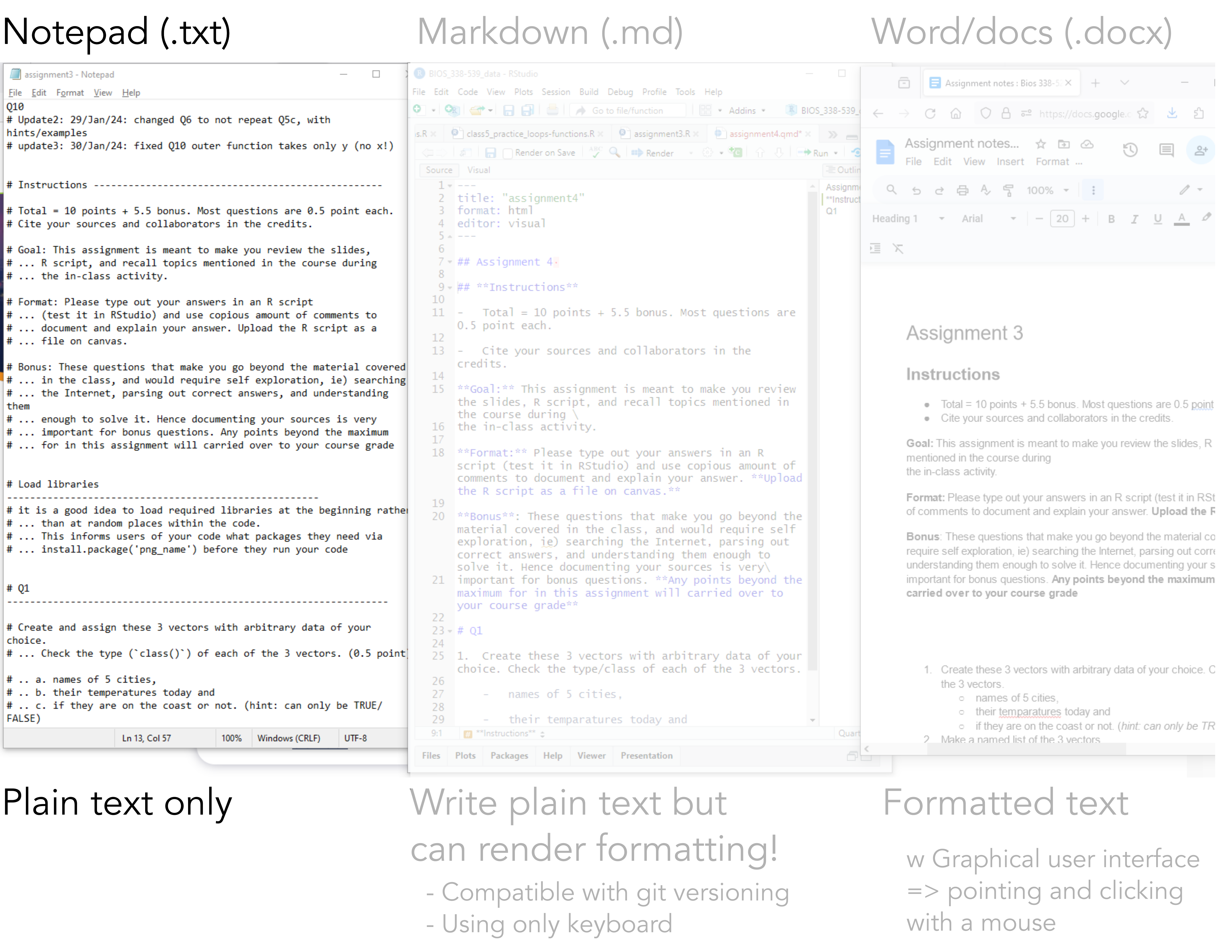
Formatted text = Word/google docs

What you see is what you get

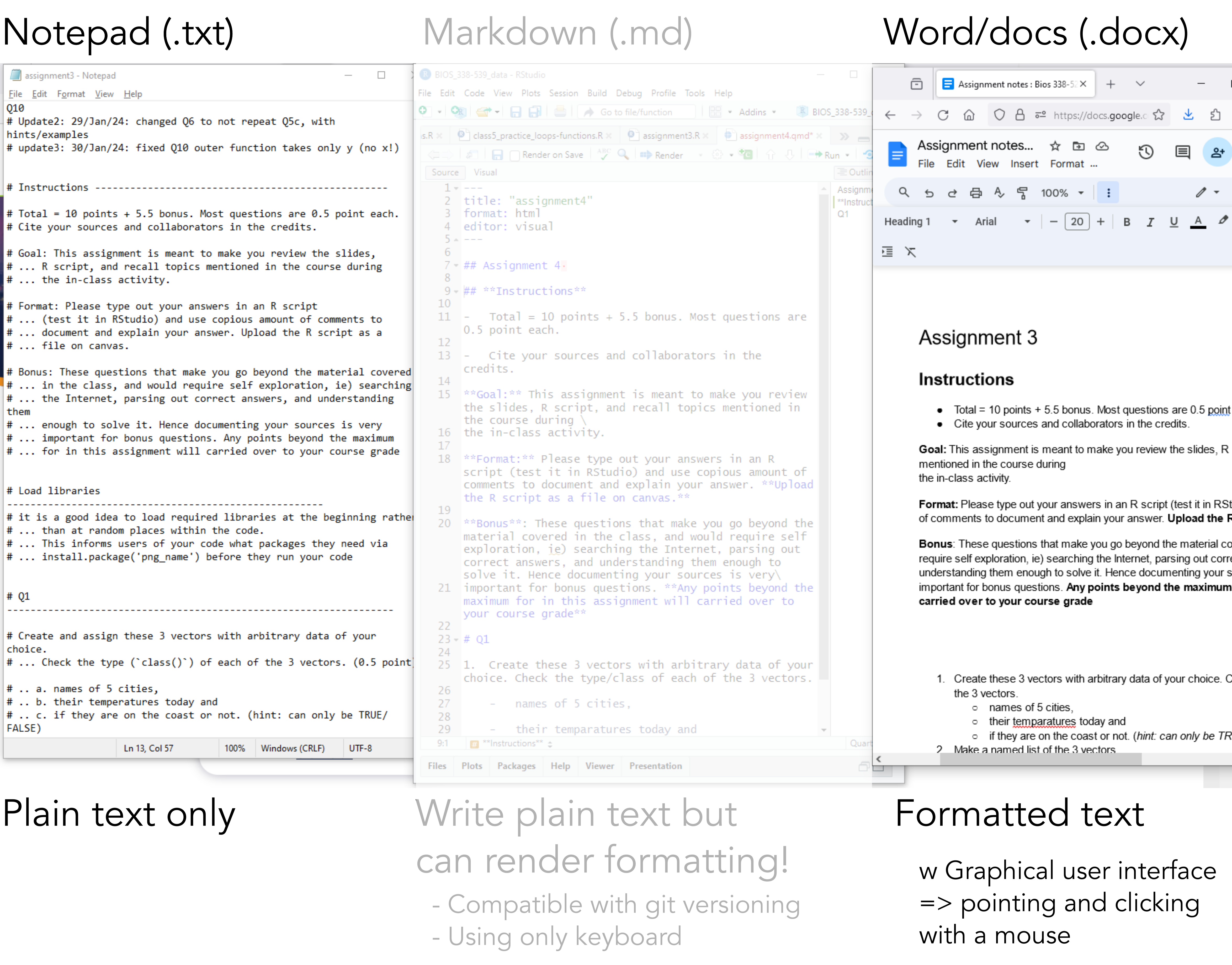
Markdown = format w plain text!

needs a renderer to convert the plain text to formatted one

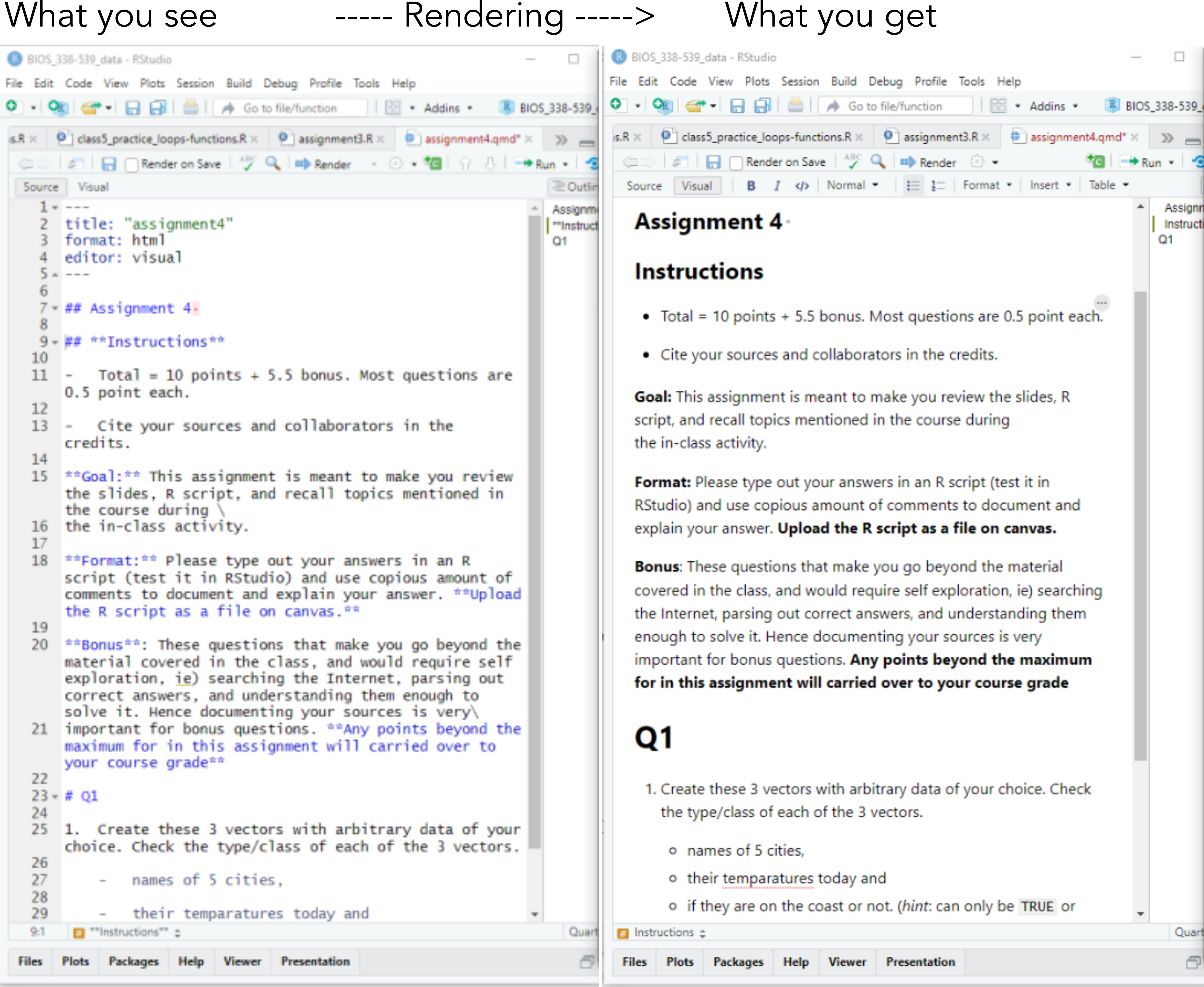
Raw vs visual mode in Rstudio

Markdown syntax : cheatsheet

Source: markdownguide.org
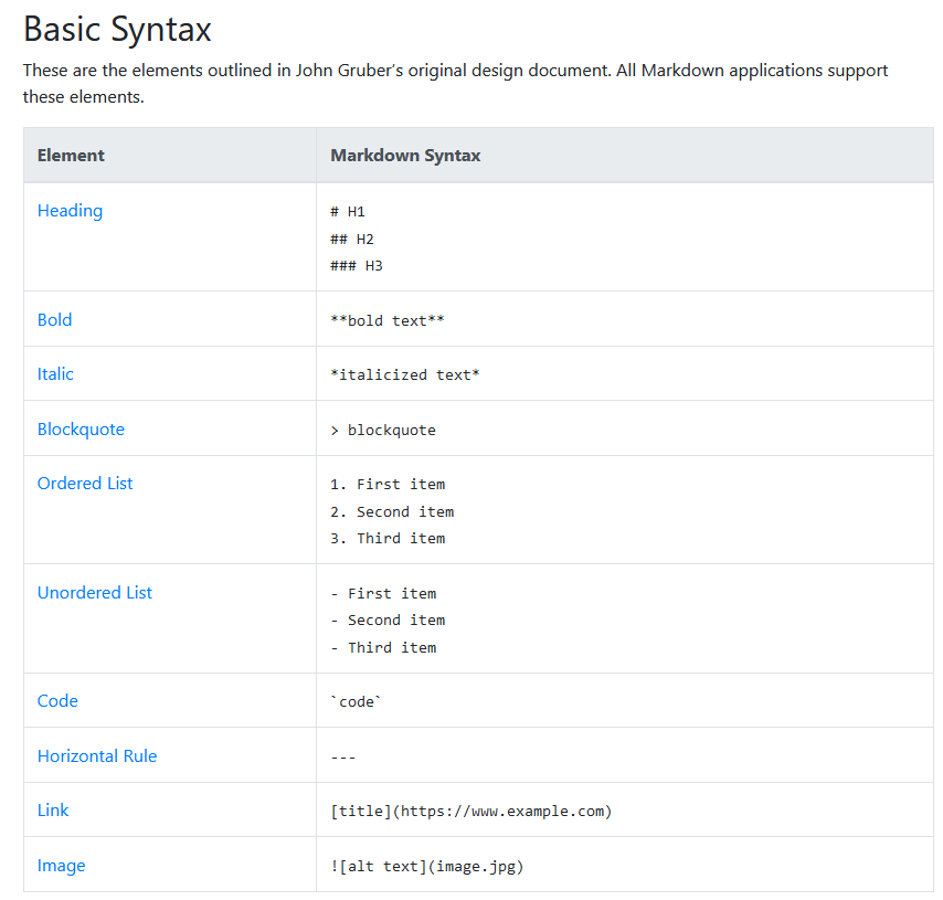
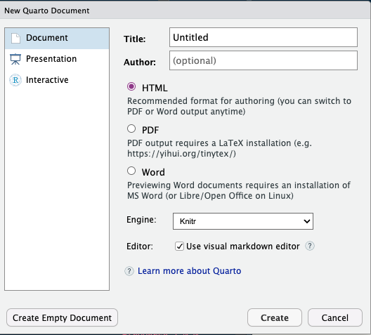
Let’s get Quarto set up

  • Download for your system https://quarto.org/docs/get-started/

  • Click the white paper with the green plus sign and create new Quarto document

  • Save the file as well using the save icon on the toolbar

New Document

  • Output types –> leave HTML for now, you can download LaTeX if you want later

  • You can change these things later! Quarto is a mix of visual interfaces you are likely used to and more command-line style as well.

How do I drive this spaceship??

Quarto is more user friendly than you may realize

A feel for the basics

  • New .qmd files have a few tips to help you get started.

  • Rendering (blue –> in toolbar) is basically synthesis

    • Can automatically save on rendering (I find this a little annoying)

    • Lets us preview the final output

Authoring

  • PDFs need LaTex

    • in terminal: quarto install tinytex
  • you can make multiple formats as well by adding to the YAML lines

  • format: revealjs –> creates a presentation, just need to reload

  • Adding citations can be a little annoying –> Link to Zotero/Mendeley

    • (Abrams 2022)

    • Insert, @ citation, choose from sources,

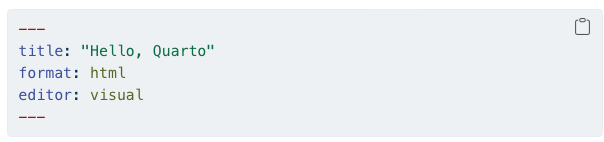
YAML header (yet another markup language)

  • However, for some documents, you may want to hide all of the code and just show the output. To do so, specify echo: false within the execute option in the YAML. Or you can do this just for specific cells of code.

Code chunks

Markdown text

Back to the visual vs. source view, you can use a Microsoft world style approach for formatting (Visual) or look up cheat sheets to learn the command-line (source). You can also easily add images by clicking image icon and linking either URL or directory for image.

Putting it all together

This is where we render to our final presentation.

Some data for today

install.packages("tidyverse")

install.packages("palmerpenguins")

library(tidyverse)

library(palmerpenguins)

Illustration of three species of Palmer Archipelago penguins: Chinstrap, Gentoo, and Adelie. Artwork by @allison_horst.

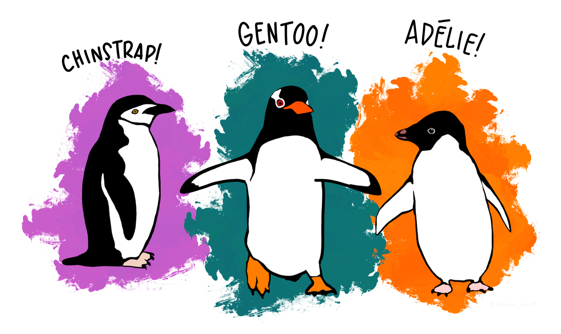
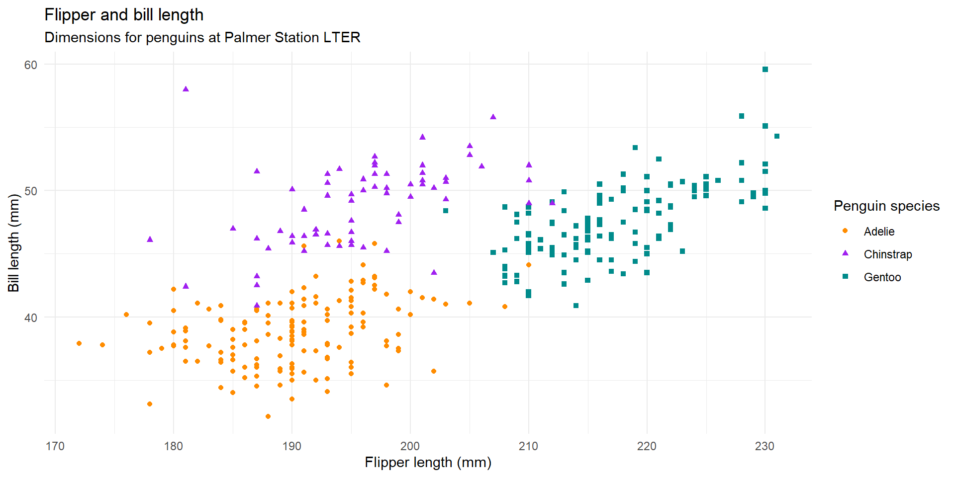
The data from the palmerpenguins package contains size measurements for penguins from three species observed on three islands in the Palmer Archipelago, Antarctica.

Onto to our data

The plot below shows the relationship between flipper and bill lengths of these penguins.

ggplot(penguins, 
       aes(x = flipper_length_mm, y = bill_length_mm)) +
  geom_point(aes(color = species, shape = species)) +
  scale_color_manual(values = c("darkorange","purple","cyan4")) +
  labs(
    title = "Flipper and bill length",
    subtitle = "Dimensions for penguins at Palmer Station LTER",
    x = "Flipper length (mm)", y = "Bill length (mm)",
    color = "Penguin species", shape = "Penguin species"
  ) +
  theme_minimal()

Plot

Okay your turn!

  1. Explore the penguins data. Visualize the data and run some basic statistics. Show both the code and the results. Explain the results with text, not with comments. Try rendering a file output.

  2. Try to create a quarto presentation with your results, this time hiding your code and only showing the results. Can you include a image from the internet as well?

References

Abrams, Peter A. 2022. Competition Theory in Ecology. Oxford University Press.